Brand identity, communication strategy and interface design for an online survey and testing tool for educators, organisations and brands.
Brand identity
User interface
Communication strategy
Code: html, css
User interface
Communication strategy
Code: html, css

The brandmark serves as a single-letter monogram “Q” and also suggests the conversational and relational nature of inquiry through the chat bubble motif.
This brandmark was designed in 2012 and has been publicly in use since then. That’s 9 years before Quora rebranded in 2021 with this same symbol as their logo, only in red. You can read their unveiling statement here. And you can see some of the earliest snapshots of my logo on the Internet Archive: Oct 2013.


The brandline is inspired by the idea that the starting point towards deeper understanding is inquiry. Different industries use Qurio for different outcomes and the brandline had to be meaningful across all the groups. “Insights” was chosen as a flexible keyword to have meaning in any context (e.g. Insight into your class’ grasp of a subject; Insight into how people perceive your brand; and etc.).
This idea of inquiry is then rounded off on different communication mediums with a simple and straightforward call to action: Ask with Qurio.


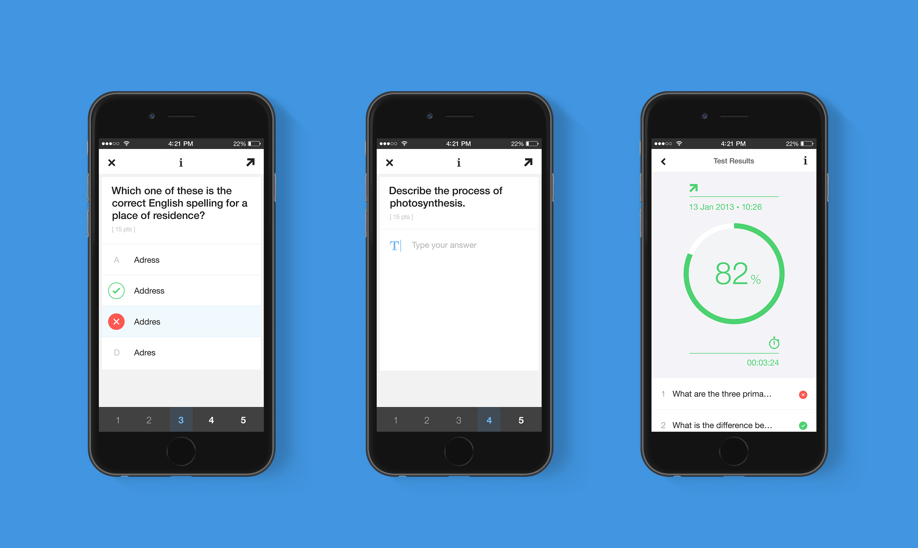
A modular design architecture enables each question component to adapt to different contexts — from question, to answer, to analytic. It makes the code leaner and lowers the cognitive affordance for users when switching context.


